
Add the Menu block
- Choose + Add at the top left of the editor.
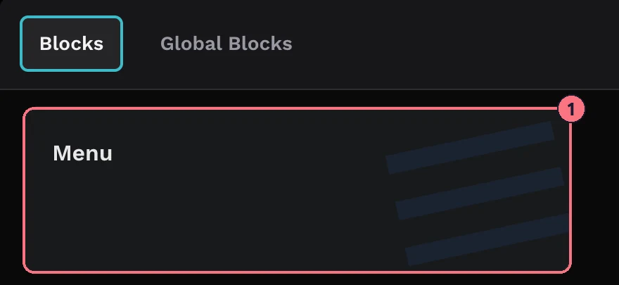
- Choose Menu (1), then Add on its card. Its settings open on the right, in three sections: Menu UI, Content and Colors.
Every change saves as you make it.
Content: your logo and menu items
Brand logo
Under Brand Logo, choose an image for the top of the menu. Type your Website URL to make the logo a link to your site.
Menu items
- Next to Menu Items, choose + Add. A new, empty item appears.
- Type its name, for example “Kitchen” or “Book a viewing”.
- Choose its link icon and pick what it opens: a panorama or block in this tour, a file from your media, an integration such as a form or chat, a Smart Bubble, a web address or a QR code.
- Repeat for each item. With two or more, Reorder lets you drag them into order.
Submenus
To group items, for example rooms under each floor, choose + Add Submenu under a menu item and add its submenu items the same way. A menu item with submenus opens its list rather than a link. Reorder Submenus appears once it has two or more.
To remove an item or submenu item, use the delete icon on its row.
Text style
Menu Text and Submenu Text each have their own font (or the tour’s font), size, alignment, bold, italic and underline, plus a background and text colour.
Menu UI: position, size and behaviour
- PositionTop Right, Top Left, Bottom Right, Bottom Left, Top Center, Bottom Center, Right Center or Left Center.
- OrientationVertical (a list) or Horizontal (a row across the screen).
- FixedPins the menu to the screen so it stays visible while visitors pan around. Turning it on adds a Width slider (0 to 100).
- Menu Height, Sub HeightThe height of menu and submenu items, 0 to 600.
- Image Width, Image HeightThe size of your logo, 0 to 600.
- Transparency0 to 100.
- Margin, Padding0 to 150. The slider sets all four sides; the button next to it sets each side separately.
- Border Width, Border Radius0 to 30 and 0 to 24.
- Image Margin, Image PaddingSpace around the logo, 0 to 150.
- Enable ToggleAdds a button that opens and closes the menu. It’s offered for positions that suit the orientation: a corner, or the middle of a side that runs the same way as the menu.
- Open on StartWith Enable Toggle on, starts the tour with the menu open. Leave it off to start with the menu closed.
Colors
- Icon, Image Bg, Background, BorderThe toggle icon, the area behind your logo, the menu’s background and its border.
- ActiveThe text colour of the item that links to the panorama on screen, so visitors can see where they are.
- Menu Text, Menu Bg, Menu HoverMenu items: text, background, and background when hovered.
- Sub Text, Sub Bg, Sub HoverThe same for submenu items.
Remove the menu
At the bottom of the block’s settings, choose Remove Block and confirm.
Tips
- Name items the way visitors think: “Master bedroom” rather than “Pano 12”.
- Big property? Use one menu item per floor with the rooms as submenus, and pair it with a floorplan.
- Check it on a phone. Open the tour on your phone before you share it; a wide horizontal menu may be better as a vertical one with Enable Toggle.
Common questions
Can a virtual tour menu link to each room?
Yes. A menu item can open any panorama or block in the tour. Use + Add Submenu to group rooms under each floor.
Can a menu item open my website or a contact form?
Yes. A menu item can open a web address, a file from your media, a Smart Bubble, a QR code, or an integration such as a form or chat (see Forms and chat integrations).
Can the menu start closed?
Yes. Turn on Enable Toggle and leave Open on Start off, and the tour starts with the menu closed behind a button.